Paylink
Client
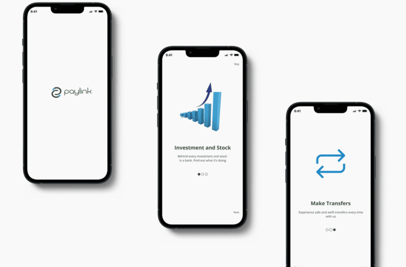
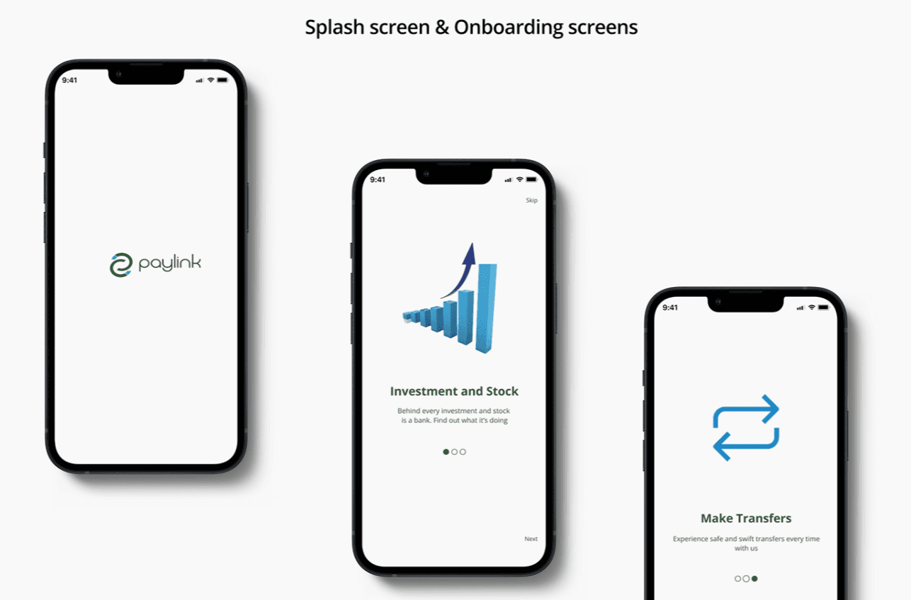
Paylink
Role
Brand Identity Designer
Year
2024
The brand identity for PAYLINK was designed to redefine the fintech landscape with a focus on speed, security, and customer friendliness. By carefully curating colors, typography, and a meaningful logo, our goal was to establish a brand that resonates with a youthful yet professional audience. PAYLINK’s visual and functional aspects work together to communicate trust, innovation, and user-centric design, aligning with our mission of connecting people, businesses, and their finances seamlessly.
Objective
The primary objective of PAYLINK’s brand identity was to craft a distinctive image that embodies:
Speed: Demonstrating efficiency and quick financial transactions.
Security: Building trust by ensuring a safe environment for users.
Customer Friendliness: Simplifying processes to provide an intuitive, delightful user experience.
The brand identity also aimed to position PAYLINK as a modern fintech solution that caters to a younger demographic while retaining an air of professionalism and sophistication.
Approach
The approach to building PAYLINK’s identity was rooted in thoughtful decision-making and attention to detail:
Colors:
Cyan Blue (#00FFFF): I chose this color for its calming effect and its ability to evoke positivity. It conveys tranquility and trust, ensuring users feel confident and at ease when interacting with the platform.
Hunter Green (#355e3b): This earthy tone resonates with growth, renewal, and financial health. For me, it represented both stability and prosperity—key messages I wanted the brand to communicate.
Together, these colors create a harmonious balance, symbolizing the blend of innovation and security that PAYLINK offers.
Logo Design:
The logo holds a special meaning for me. I envisioned it as more than just a link—it’s a representation of connection and dynamic movement. The two opposing arrow-like ends in cyan blue signify sending and receiving, the essence of what PAYLINK facilitates. For me, this visual element perfectly captures the brand’s mission of seamlessly linking people and businesses in the financial ecosystem.Typography:
Selecting the right typeface was crucial. I chose Biysk Regular for its clean and contemporary look. Its simplicity adds to the brand’s readability while its modern aesthetic appeals to a youthful audience. To me, this font reflects the approachable and innovative nature of PAYLINK while still exuding professionalism.Tone and Messaging:
I intentionally kept the tone warm, friendly, and customer-focused. My goal was to ensure that users felt they were interacting with a brand that values and understands them, rather than just a sterile fintech platform.
Results
The final outcome of PAYLINK’s brand identity embodies everything I envisioned:
A Strong Visual Identity: The thoughtful combination of colors, typography, and logo ensures the brand stands out and is memorable.
Trust and Connection: PAYLINK’s design fosters confidence and trust while maintaining a welcoming, approachable feel.
Audience Alignment: The modern aesthetic of the brand resonates strongly with a youthful demographic, aligning with their preferences and expectations.
Mission Fulfillment: Every aspect of the brand identity reflects PAYLINK’s core mission—to provide fast, secure, and customer-friendly fintech solutions.
For me, PAYLINK is more than a fintech platform—it’s a promise to users that their financial journey will be simple, seamless, and secure. Every design choice reflects my personal commitment to ensuring that PAYLINK feels as human as the people it serves
